via your classmate Yianni:
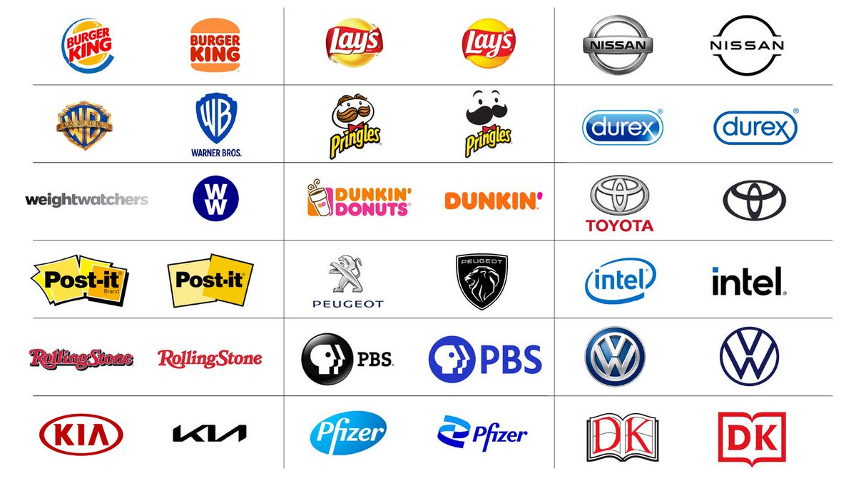
It’s subtle, but you may have noticed that amid the various societal changes and trends that occurred during the 2010s, countless major brands have implemented almost the exact same type of change: their logos!
Traditionally, we may have thought of a “successful” and “strong” brand logo as being one that was intricate and elaborate in its design, with major companies and corporations spending considerable resources to perfect the complexity of their desired logo. Everything from the shadows and depth of a logo’s font to the 3D appearance and cartoonist “pop” of a logo was deemed unique and subtly engaging.
Over the last few years however, there has been a reversal of this tendancy by some of the world’s most recognizable brands. As you can see in the image above, many major brands have transitioned from logos that incorporated detail, depth and 3-dimensional appearance to flatter and “cleaner” designs with simpler colours and fonts.
Is this just another fad or trend among fashion cycles as it pertains to logos and art, or is there something to be said about the psychology behind consumer behaviour and our innate response to simpler and abstract designs? Perhaps as society became more oriented and accustomed to efficiency and simplicity in the types of products and services we demand and use, we inherently desired a more simplistically-designed logo to be accompanied with it?
Article from:

Great post Yianni! I enjoyed the article and seeing all the changes numerous brands went through to make their logos flatter such as Burger King and Pringles. I believe this definitely relates to the psychology behind consumer behavior.
Brand managers and designers are looking at their brand and strategically developing the visual identity of the brand to be simpler and reduce the complexity of their message. As we learned in class and went through an exercise of trying to breakdown logos and what they mean, it was at times a lengthy process describing what a particular logo meant to us. If a logo has a lot of unnecessary detail, then a consumer will have more information and potentially overthink a brand and the value they could bring. A simple and less complex logo is easier for the consumer to absorb information, process it and move on with the brand.
Another big reason for this trend of simplification is using the logo across multiple platforms. I remember when I was graphic designing and came up with a logo for a small business, it did not translate so well across different mediums. It would look great on their website and digital platform however when printed and shown on reports or business cards, it wouldn’t capture the same consistency or feel as it would digitally.
I personally love this trend for simplification because it makes the brand look more professional and meaningful. As a person who also loves making logos and a huge overthinker about capturing every detail, it removes some of the stress!
Again, great post and interesting read!
Hi Yianni, great post! I hadn’t realized how many brands had changed their logo within the last few years until I saw the graphic that you had posted. It’s really interesting to see, especially as our generation has grown up with these logos. It’s a little bit jarring to see how much they have changed. For example, the Kia logo looks unrecognizable and I think I’ll still remember the old Kia logo if anyone ever brings the brand up.
I first noticed this trend happening with fashion logos. Many luxury fashion brands like Balenciaga, Burberry and Yves Saint Laurent switched their logos to be black and white with a simple sans serif font. I think brands are simplifying their logos because there is an overall trend of simplification right now. Minimalism is becoming more popular and as our lives get more crowded and noisy with the advertising that is being thrown our way, consumers might be feeling overwhelmed and will appreciate the shift to more simple branding.
Personally, I do like how simple logos are but at the same time, I feel that the brand’s personality is not being represented like how it used to be. Looking 5-10 years into the future, I wonder what the next big trend in branding and logo design will be.
Hi Yianni,
Interesting post! I have noticed this simplification of logos trend, and as a graphic designer myself, I appreciate these cleaner looking logos. I also mostly approve of it from the consumer side, as when we are overwhelmed with advertisements and marketing communications, it makes it easier to digest. Furthermore, I find it helpful in a technology setting. When browsing my phone or smartwatch, the last thing I want to do is strain my eyes looking for complex logos on small screens.
Something interesting I noticed was the trend of brands with highly recognizable logos simplifying them. This could be a sign that their brand equity is already strong enough that consumers will recognize the logo regardless of how simple it is. A few examples of this is with Starbucks, Nike, and McDonalds. All three brands removed text from their logos. The Starbucks mermaid, the Nike swoosh, and the McDonalds Golden Arches became so iconic that the logo no longer needed the brand name on it. I believe this marks a noteworthy point in a brand’s history in which their brand awareness is at its peak.
In contrast, I do believe this strategy is not well-suited for some brands who have taken it too far. I have heard the term “blanding” used to describe this. It often makes the brand lose its unique personality when it becomes oversimplified. In my opinion, this happened to Pringles. They oversimplified their iconic logo to an incomplete face. Not only is the new logo creepy, but it is unrecognizable at first glance as Pringles.
Loved reading your post, Yianni! The simplification of many of these logos from iconic brands is something that I noticed changed over the years. You posed a question about consumer behaviour with psychology, but I also think brands like to hop on trends of one another.
Now, in the 2020s, we see this common theme of solid colour, flat lay logos. A couple others I thought of were Apple and Coca-Cola. I personally think that brands are trying to keep up with other brands. To stay on top of trends, if a number of brands are moving in a specific direction (and are going well), others will follow. If we look at the ‘before’ logos, there’s a trend of them all having similar designs/themes — shine, 3D effects, gradient, and/or with a drop shadow. That branding theme was obvious a theme or trends because almost all of them have a similar style. Going into this new decade, they all have this other similar design/theme — flat, solid-coloured, minimal, and simple.
Keeping up with trends aside, I think some of the consumer psychology behind it is that simpler logos may be more memorable for the consumer to recognize, remember, and absorb. In addition, with the photo you posted, many of the current brand logos aren’t drastically different from the older ones. As consumers, we are still able to recognize the same brands from the redesigns. This could include shapes like the Lays circle, images like the PBS faces, or colours like the Dunkin’ orange & bright pink. These changes aren’t meant to be drastic because they are easily recognized and memorable to the consumer.
Yianni, I hope this comment finds you well! I found this post is very informative as I noticed right away the attached image of all companies that have their logo redesigned in the minimalistic format. I do think this minimalistic logo design approach is the future of logo design. That is because before all companies were known to be company-focused which means that whatever the company believes to be effective and meaning was always the way to go. However, due to the increase of customer-centric approach in majority of the organization, it is essential to know what the brand manager can do to serve the consumers’ needs. And in this case, maybe all the consumers need is just a logo that is easily recognizable and memorable? Therefore, I can understand why more and more companies start to simplify their logo which I do not think this would be a fad. The simplified version of their logo also gives a modern look into their branding. You do not want consumers to recognize you as an old-looking brand? Always keep the brand up to date!